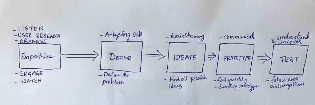
Design process:
This is the design process that I followed Initially is as shown in the below picture:
1)I started with "Analyzing the given dataset" first and defining some problems from the data.
2)Brainstorming and trying to find the possible solutions or ideas using this dataset like for example, what information I can gather from the given dataset.
3)Correlation of the different table(datasets), I have tried all combinations and permutations of the given data.
4)After understanding the data and data correlations, I tried to present information in such a way that which is meaningful and a possible visualization.
5) Finally, Tested the working prototype based on the user's assumptions.
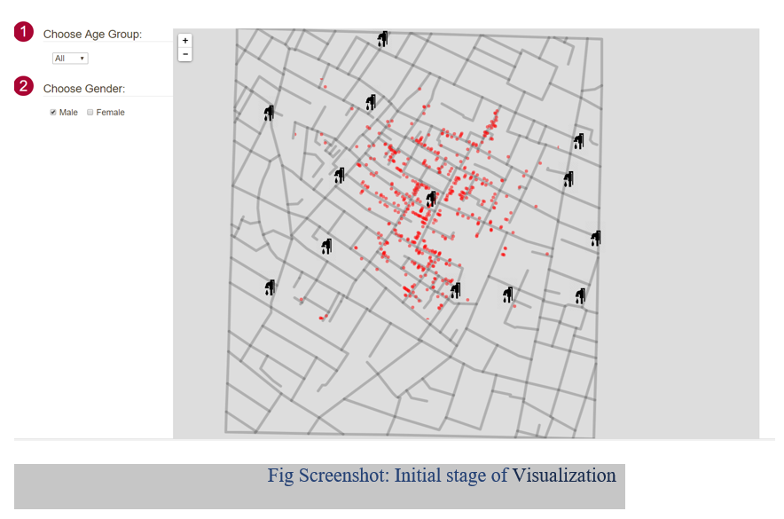
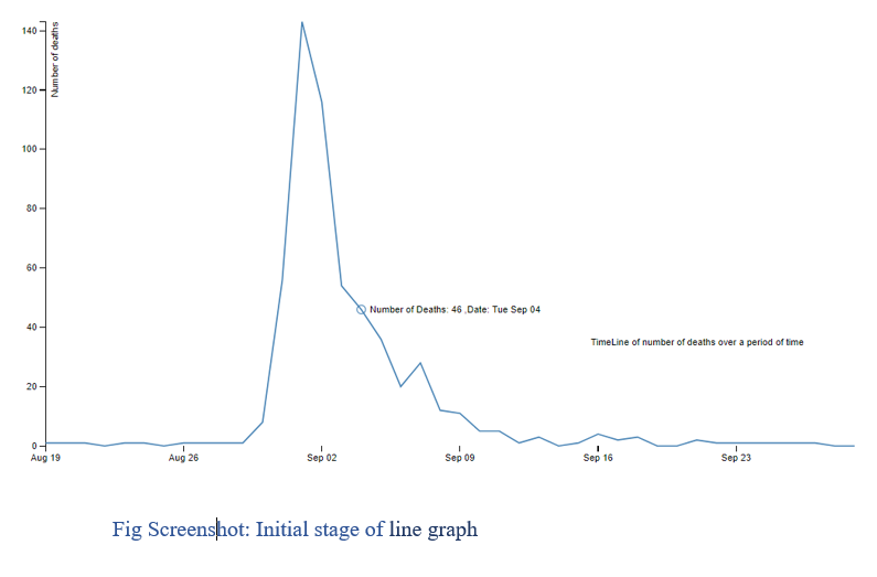
Initial or First stage of Visualization is as follows:
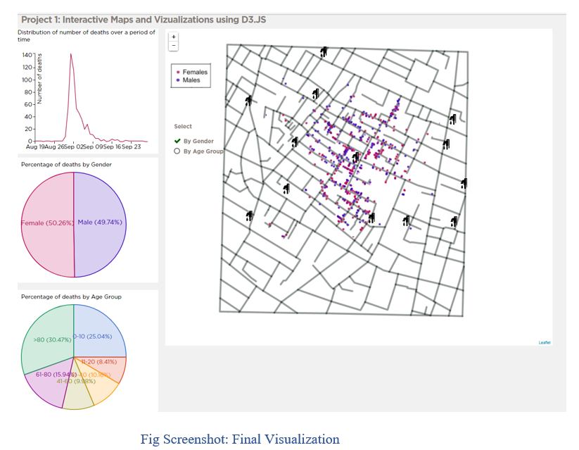
Initial Visualization contains a well-drawn map of the area along with the streets and pumps including the locations of the deaths and dropdown of all age groups and checkbox list for male and female and based on those selections user can able to see the number of male and female are infected in a certain area or street along with the selection of age group. I thought of using drop-down and checkbox as a filter and wanted to show the matching result on the map but, I found that It is not more effective or not a good way to show the visualization because I'm unable to analyze exactly how much percentage or the correct number of deaths based on the gender and age. In the final visualization, I have used pie chart and line graph to analyze the correct amount of the deaths occurred in this particular area or street. I have designed the line graph an interactive way so that if you try to place your course on the graph you can see the number of deaths occurred on a certain date.
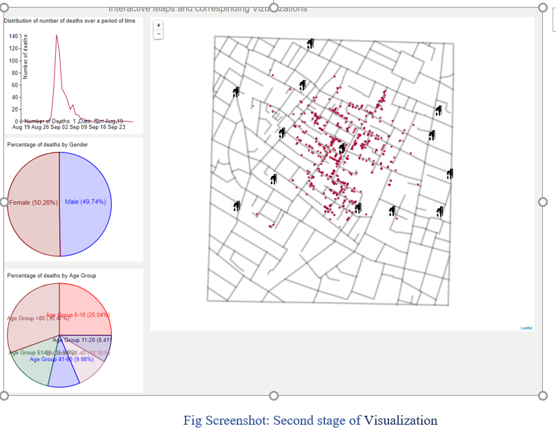
The second stage of Visualization is as follows:
The rationale of your design choices:
I have used this gray color to represent the streets/Roads so that user can easily understand that this is a map with streets and I thought of using red color to represent something bad happened or event of deaths occurred in a certain area. But, keeping in mind that, Red color blindness is the common blindness most of the people have so I have used a combination of colors which is somewhat like red where the red colorblindness people can see those colors. Pumps are in black color and added an option to Zoom in and Zoom out where the user can interact with the map using this options.
I have used this line graph to clearly show the distribution of a number of deaths over a period and pie-charts to show the Percentage of deaths by Gender and Percentage of deaths by Age Group. I have used a combination of colors for this pie-charts where a person with colorblindness can see them clearly.
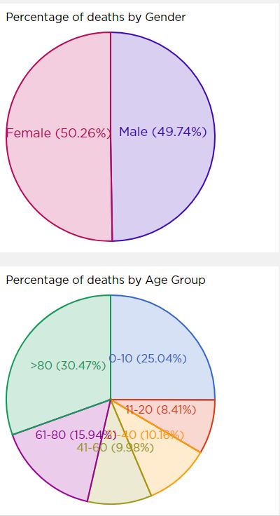
Pie chart:
There are 2 Pie chart plots Percentage of deaths by Gender and Percentage of deaths by Age Group. At first, the color of the pie chart sector was of close and different to distinguish colors but at later it is changed based on the point of the design changed it to reflect the value of each sector with a label to show the color of the sector to which it belongs. During the early phase of the design, both the pie chart has outer colors to represent each sector in case of by Gender or by Age Group. This choice is made because obviously the % of male and female or age groups can be visualized well and hence its better choice over various visualization like line chart and bar chart.
Line Chart:
The line chart gives the distribution of the number of deaths over a period of time, from mid-August to end of September. When we hover over the line chart, observe is the number of deaths over time of days on the timeline graph. We can see deaths started and reached the peak on 143 deaths on Sat September 1st and decreased over time. It clearly shows that it not increasing with time to over areas.
Interactive Map Distribution of deaths over time:
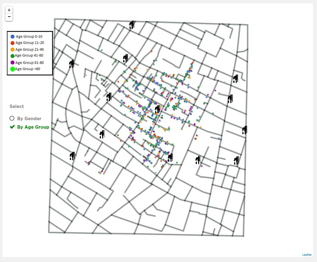
Interactive map shows all streets, water pumps and death coordinates on the map. The map is interactive with the ability to zoom in/out and pan around the map.
The map provides the ability to cluster the data on the map into a grid that shows the number of dead in each grid cell and the user should be able to vary the size of the clusters.
You can see clustered data where there is an overlap of deaths you will be able to see darker color that indicates multiple deaths at a point and this is achieved by CSS Transparency of certain percentage enabled for a point.
Color Blindness Test:
I have done color blindness test for various categories like red, green and blue can easily access website and also more complex color blindness like Deuteranopia(red/green color blindness; anomalous green cones), Tritanopia (blue/yellow color blindness; anomalous blue cones) can easily able to visualize distinguish and analyze very well like normal but Protanopia(red/green color blindness; anomalous red cones) may have slight problem but still by using shades of gray distinguish visualization's very well.
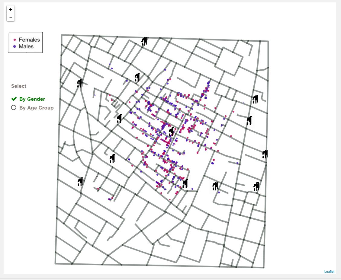
Final Visualization:
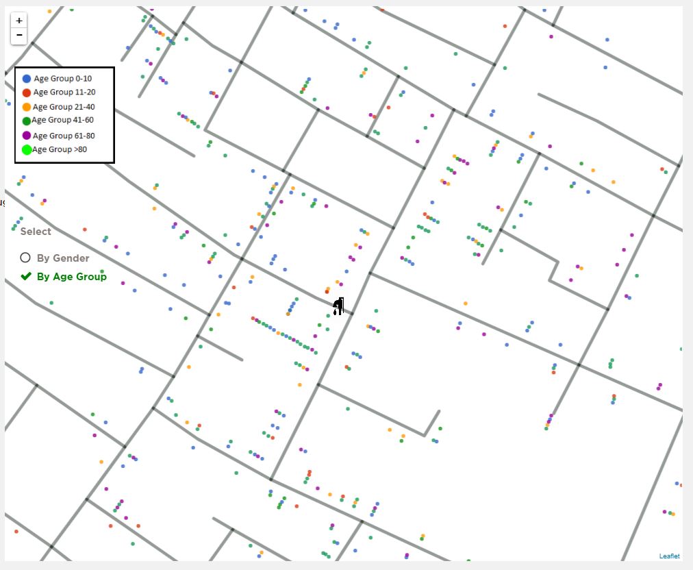
As you can see this is the final visualization. Where I have added more interactions to the map. As shown in the below picture you can see that there are two selective radio buttons “By Gender” and “By Age Group” and by gender, radio button will be selected by default.
I have added these options where the user can select one of them and can able to see the number of deaths by gender (female and male) on the map. For instance, we can see that females are more affected by this incident than male.
And by selecting the "By Age Group" radio button user can able to see the number of deaths by age group like for example, as we can see in the visualization that age group from 0 to 10 and age group greater than >80 are more affected by this incident than other age groups. To see the exact number or percentage of deaths, I have added these pie-charts where the user can have a clear percentage of deaths by gender and age.
References:
1) http://bl.ocks.org/Sumbera/10463358
2) http://bl.ocks.org/d3noob/9267535
3) https://www.udemy.com/data-visualize-data-with-d3js-the-easy-way/learn/v4/overview
4) https://d3js.org/
5) https://bl.ocks.org/mbostock/3883245
6) https://bl.ocks.org/mbostock/3887235
7) https://www.w3schools.com/graphics/svg_intro.asp
8) https://www.w3schools.com/w3js/
9) https://www.w3schools.com/w3css/
10) https://www.toptal.com/designers/colorfilter
11) https://codepen.io/rstrahl/pen/yyEYBx.
Youtube video showing the use of visualization with narration.